CPPIB
A new design system and website art direction help CPP Investments to deliver an elevated brand experience with a renewed focus on thought leadership.
Challenge
The Canadian Pension Plan Investment Board (CPPIB) needed to redesign and restructure their website. The update needed to show CPPIB as a modern, dynamic brand and reflect their enhanced focus on delivering thought leadership.
Solution
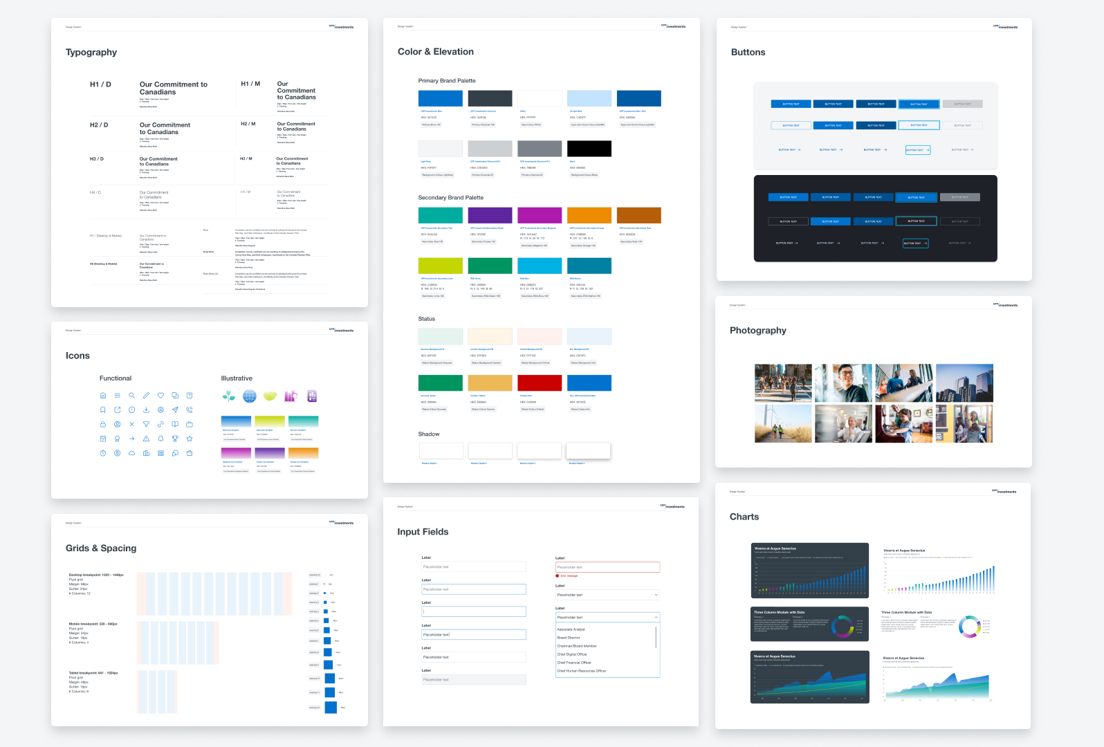
We started with an audit of all existing content and components. We then created a new, SEO-optimized navigation to ensure visitors could quickly find key articles and investment leaders. From there, we redesigned and added extensively to a design system library of components, modules and page templates with a spacious, open feel to give the brand a feeling of modernity and transparency.
PROJECT
Website design, design system
ROLE
Design & Art Direction
COLLABORATION
Part of the CPPIB team at GALE Partners


DESIGN PRINCIPLES
Foster Trust
We need to foster trust and elevate the CPPIB brand in all interactions through both user experience and design. Our goal is to increase audience confidence through clarity, consistency, and visual sophistication.
Design with Purpose
Start with a clear goal to understand the intended outcome of a component or module and define how it can improve a user’s experience. Content strategy should be considered for both UX and UI design, and all interactions should be relevant and allow for ease of navigation.
Accessibility First
CPPIB is for all Canadians, so the website’s design and UX should be welcoming to a wide variety of audiences, with top-tier accessibility considerations and implementations.
Accessibility First
For a design system to scale efficiently, flexibility and rules need to be balanced. Design of components should offer enough flexibility to support various content and use cases while still providing comprehensive documentation for use and best practice, so visual consistency is retained.
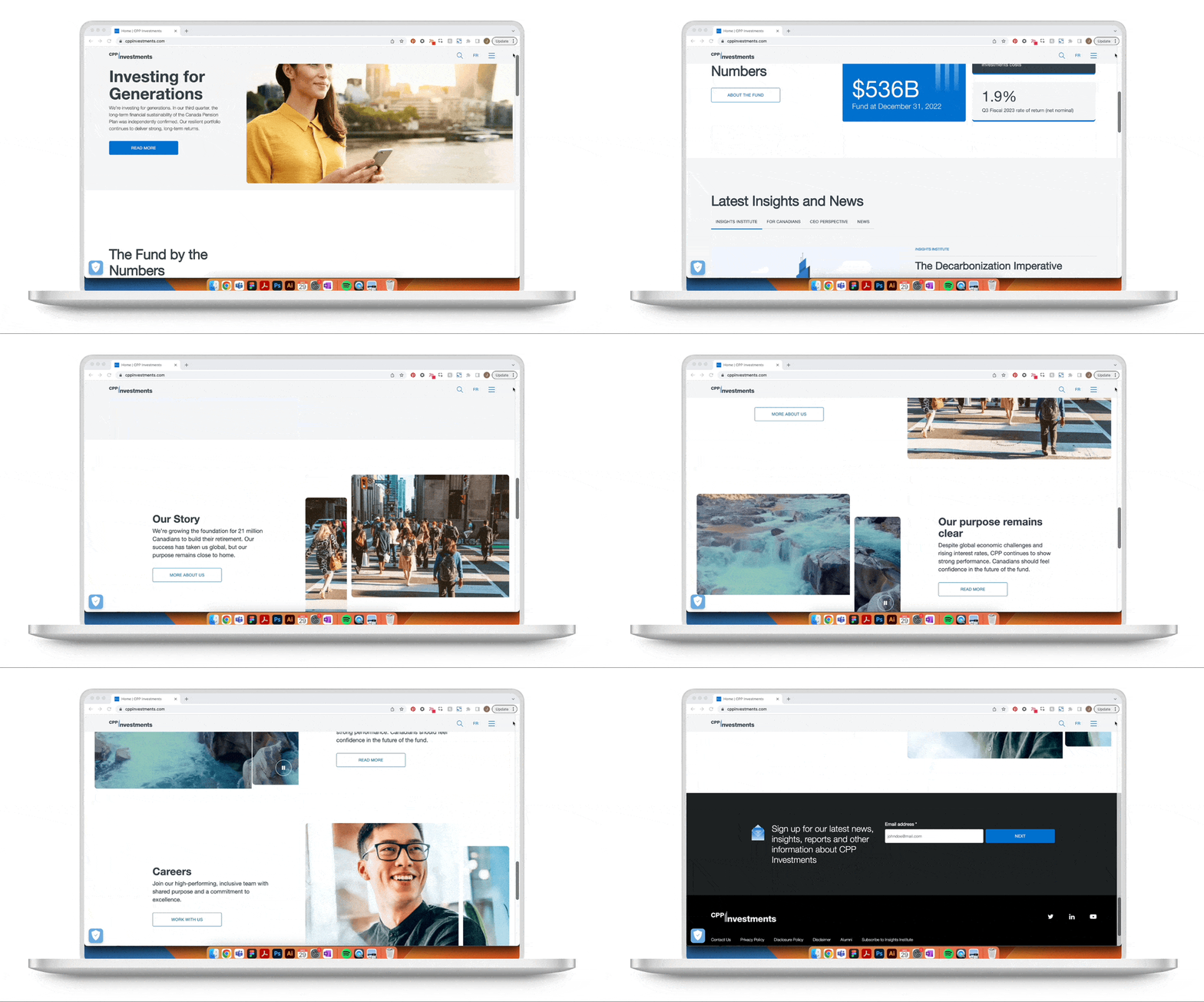
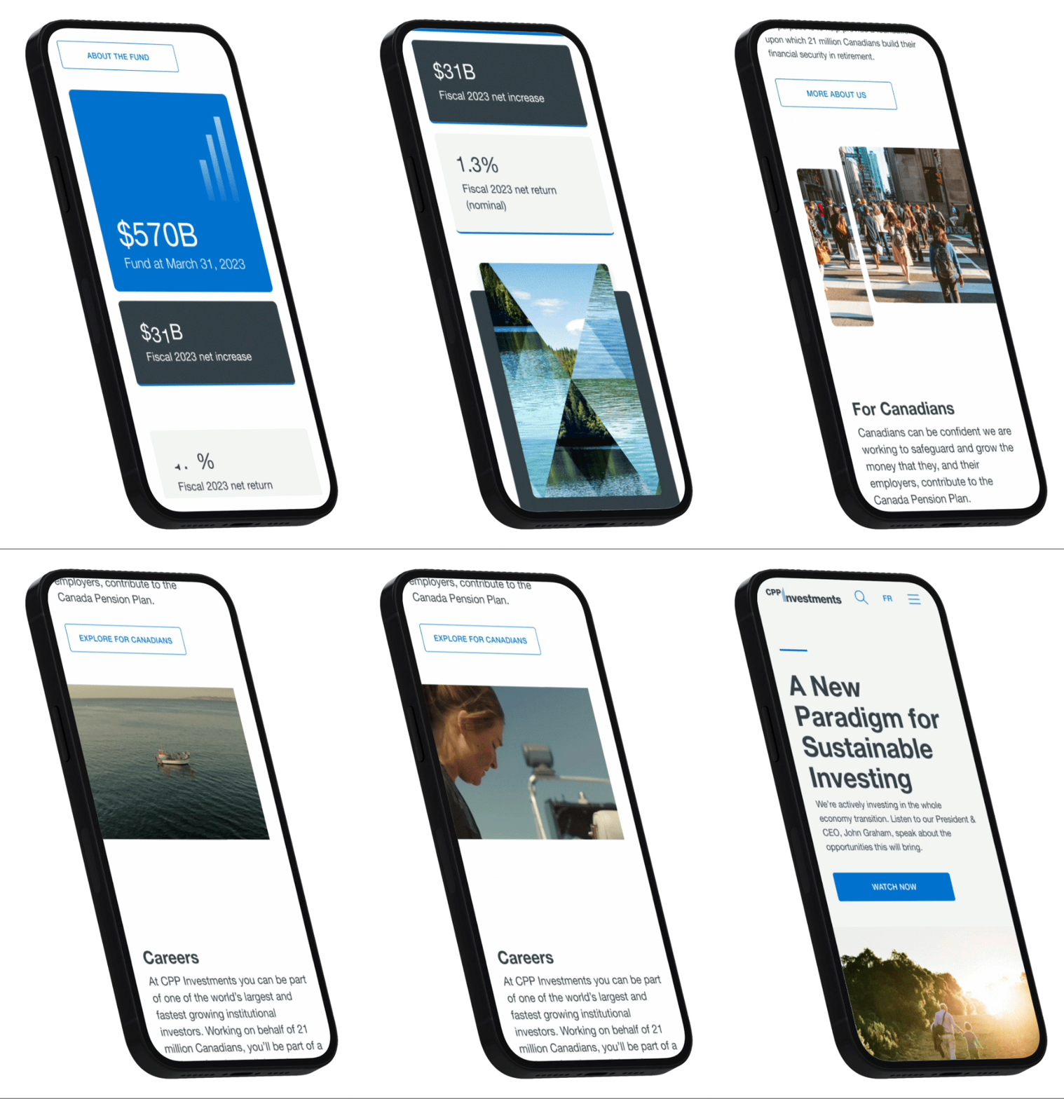
The Digital Evolution of CPPIB
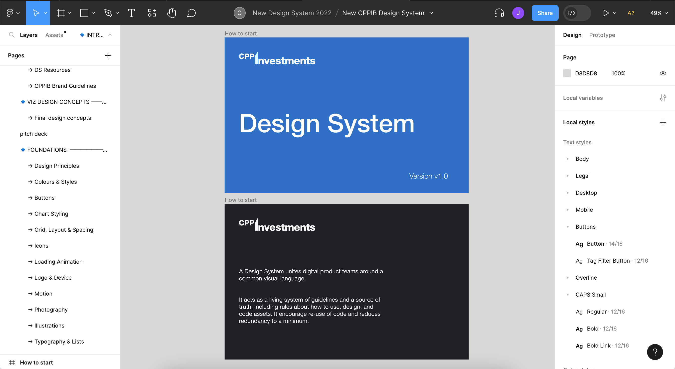
As GALE had evolved our relationship with CPPIB over 5+ years, we noticed that the site needed not only a facelift, but a design system and a content framework that would ensure that the site could continue to serve the organization’s changing needs – without adding bloat, confusion, and complexity.

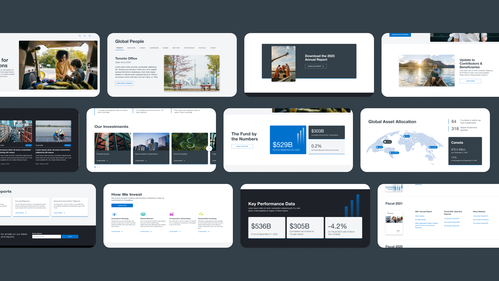
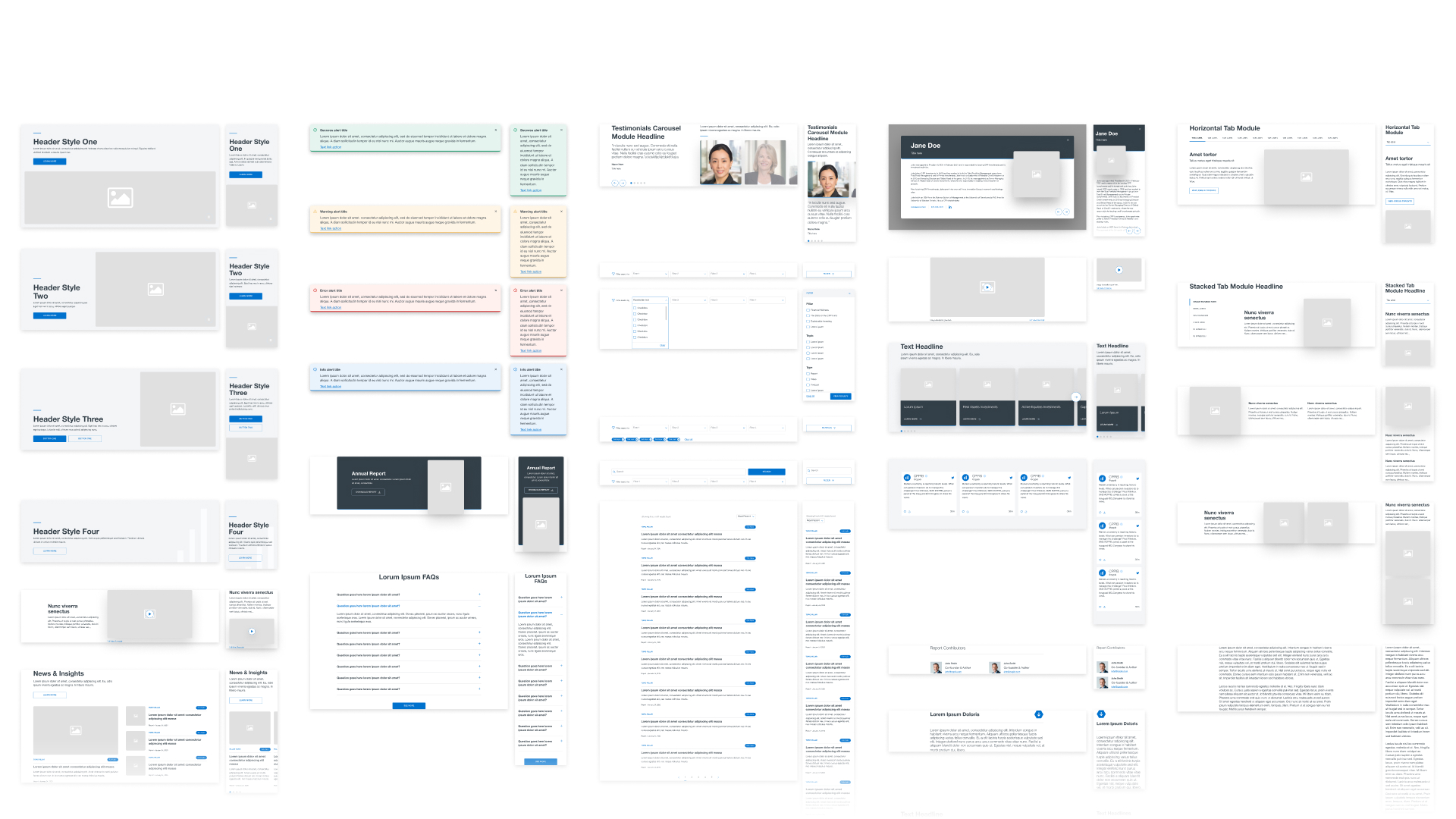
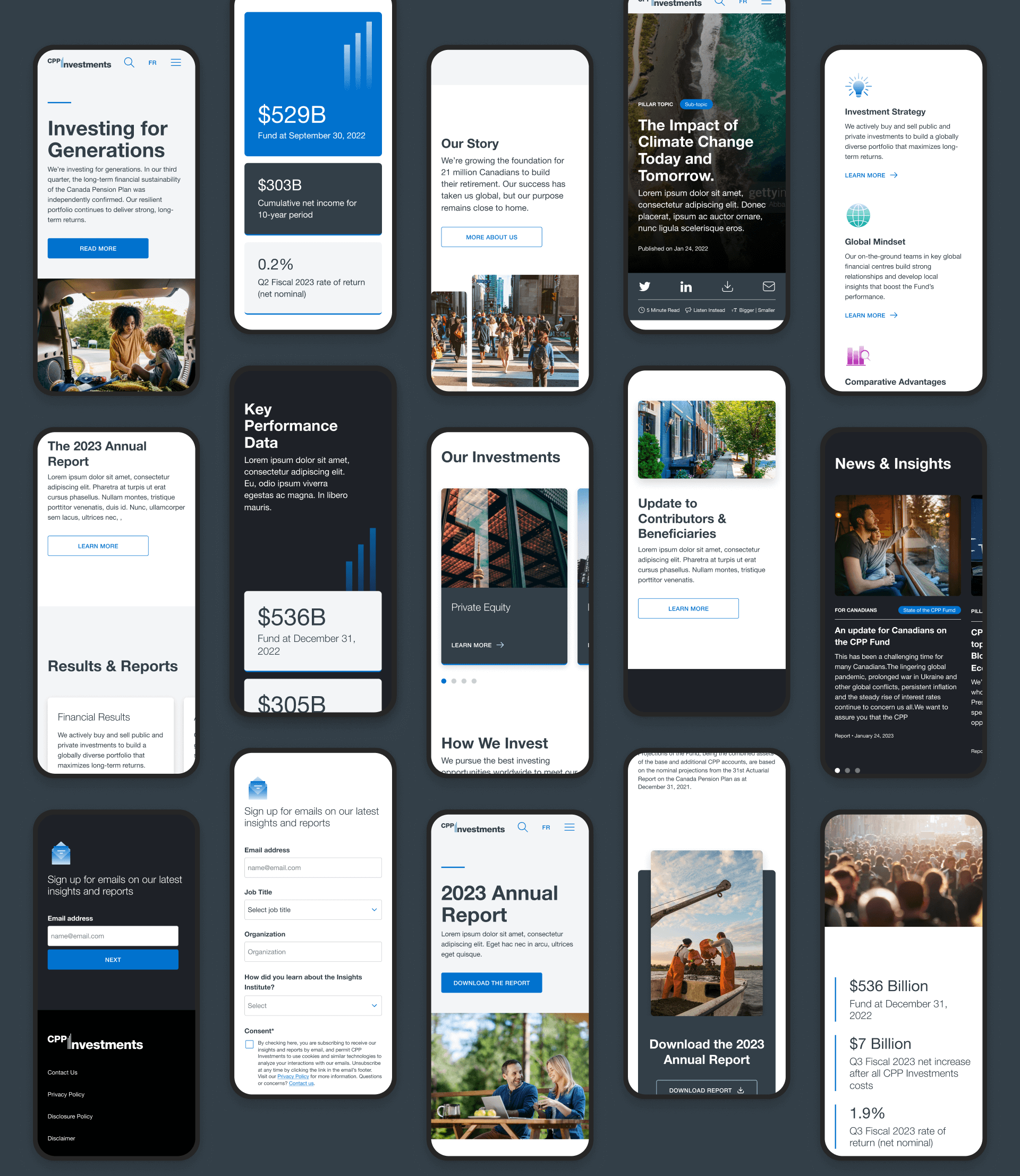
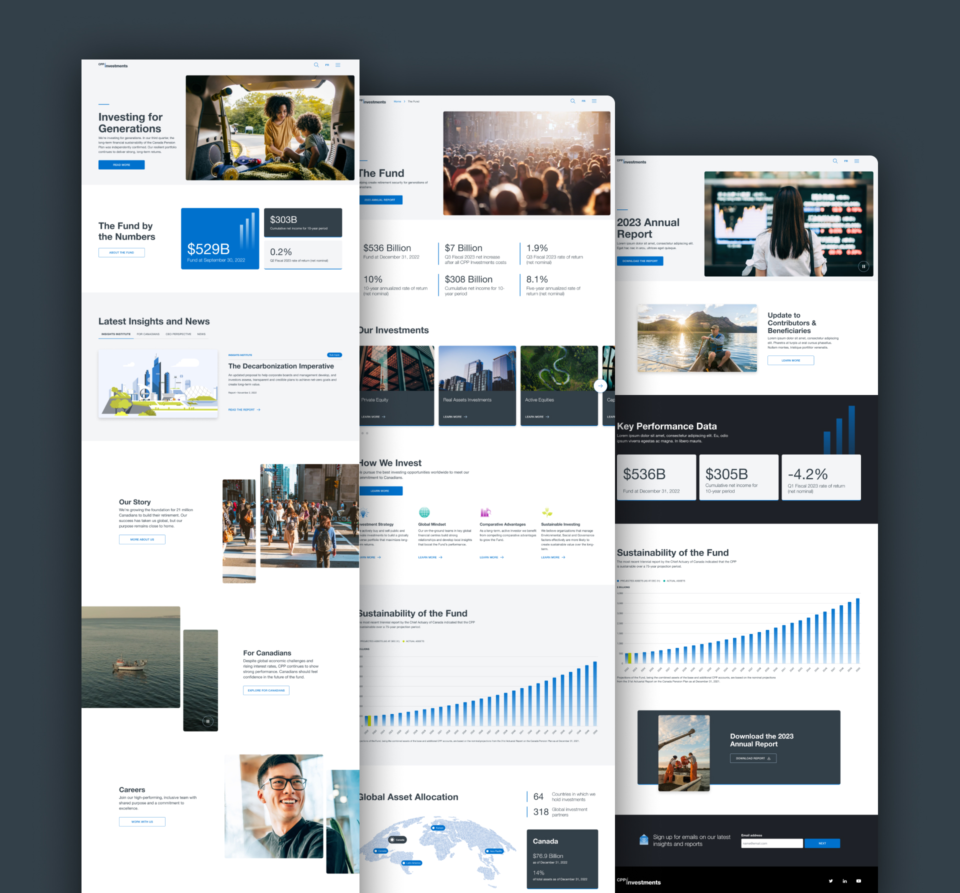
Components & Modules
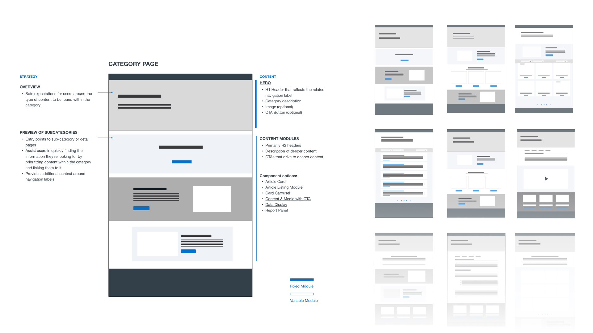
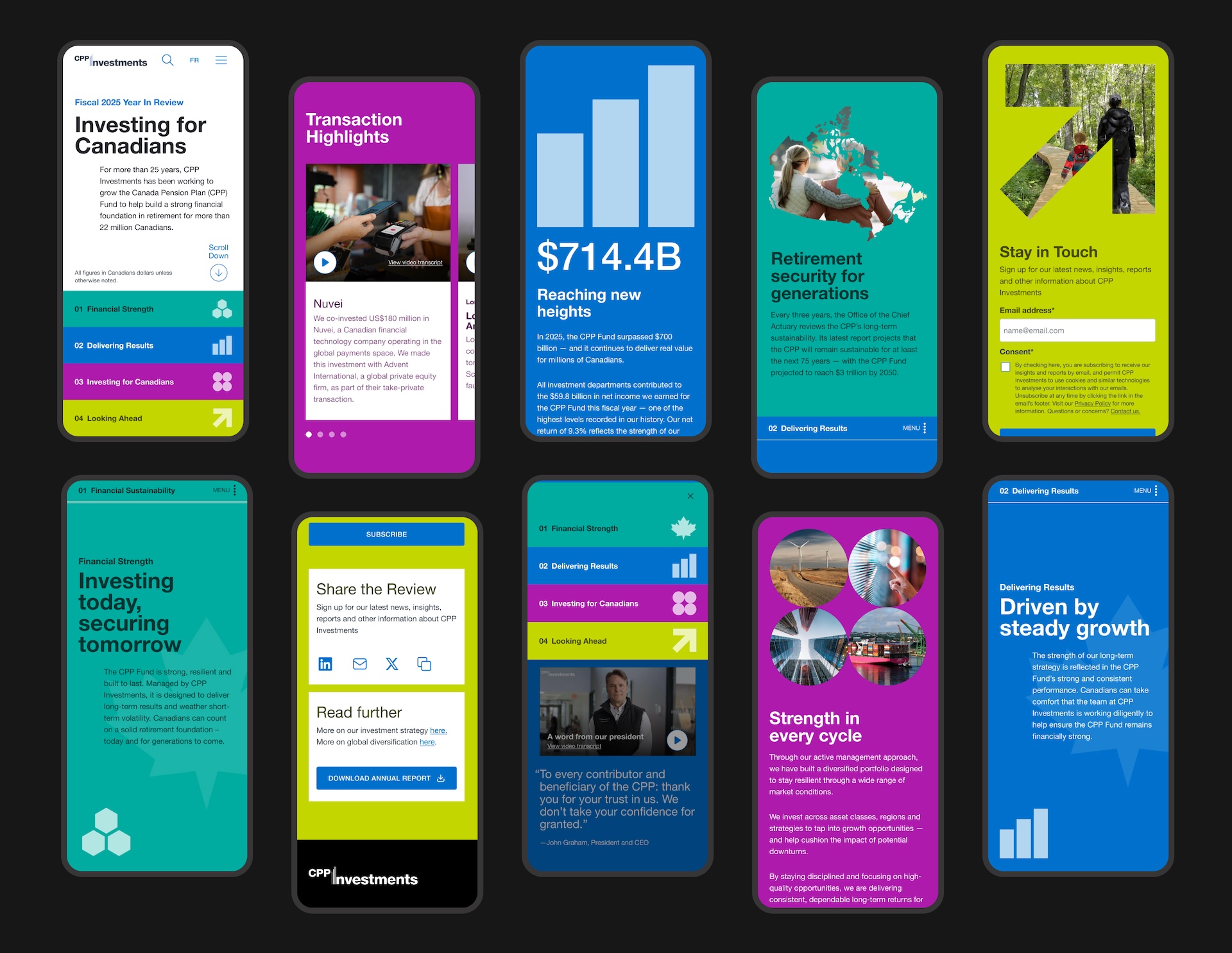
I designed the system to have a base set of components and modules to use as templates for redesigning existing pages and for any new pages needing to be made.
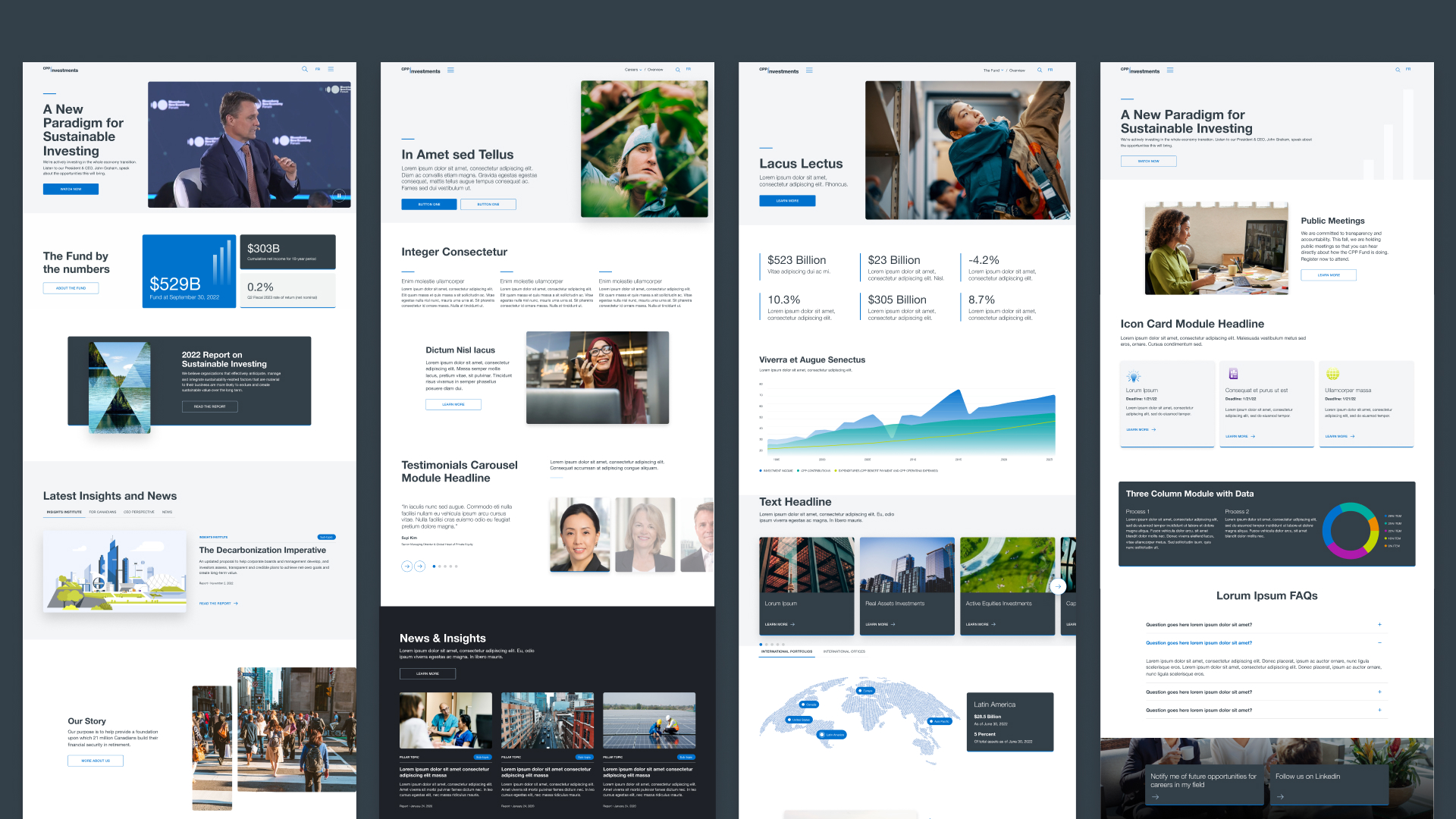
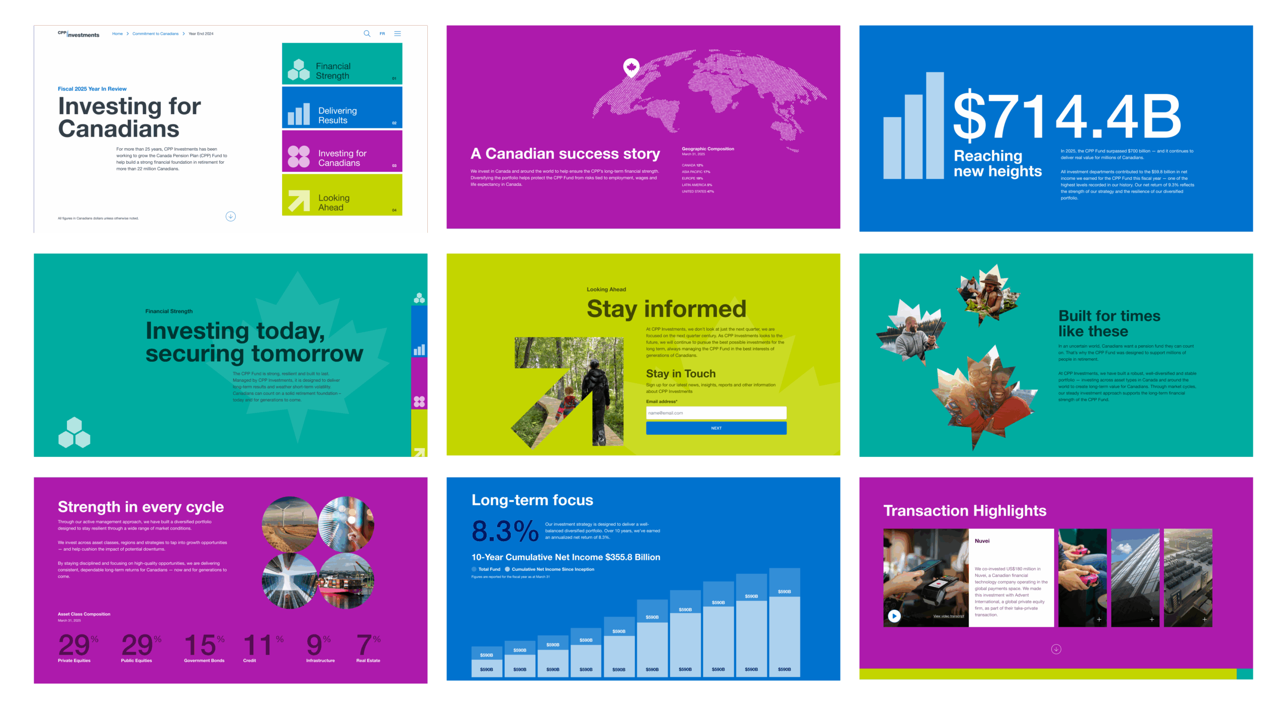
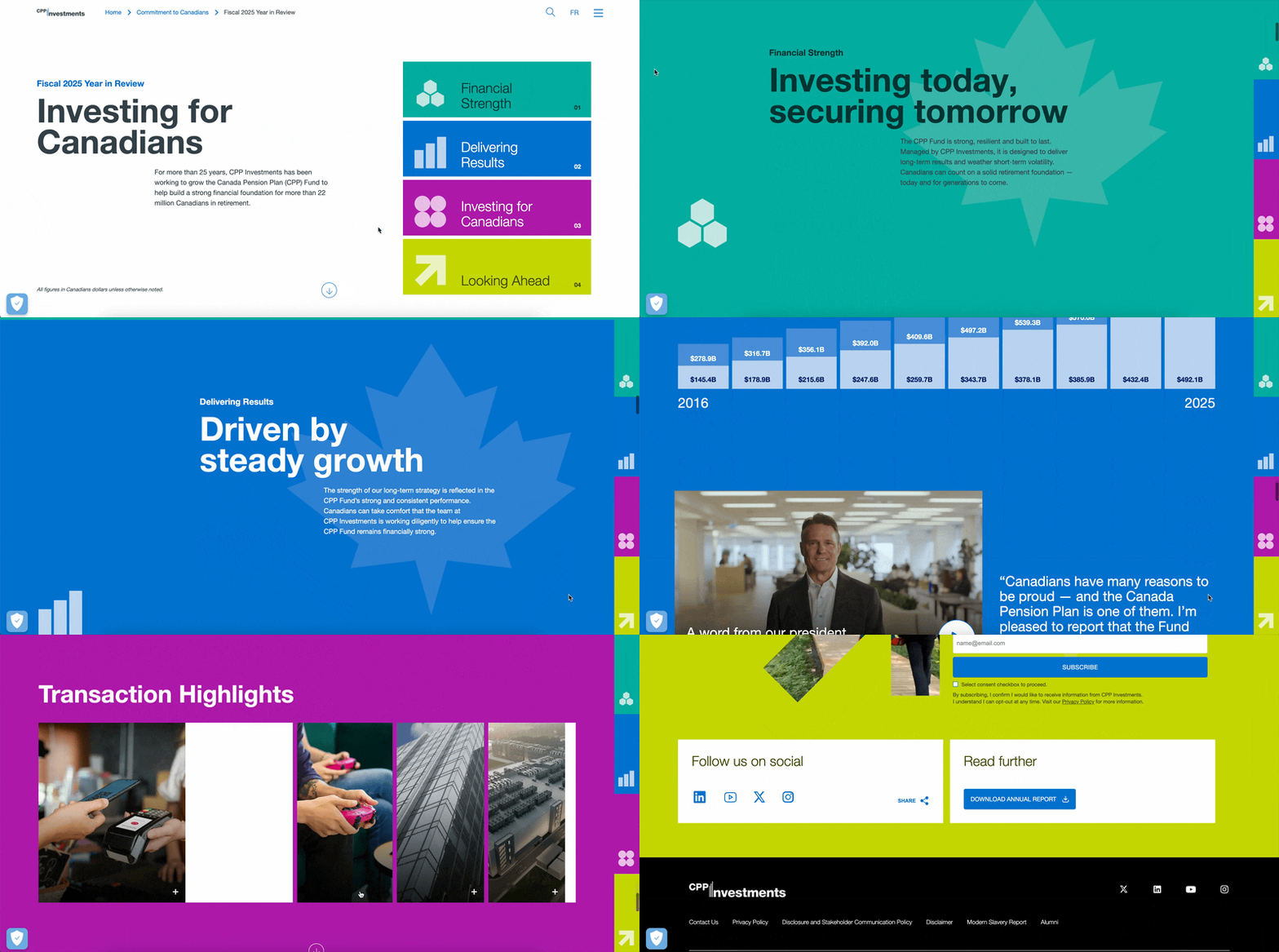
Using Data to Foster Trust
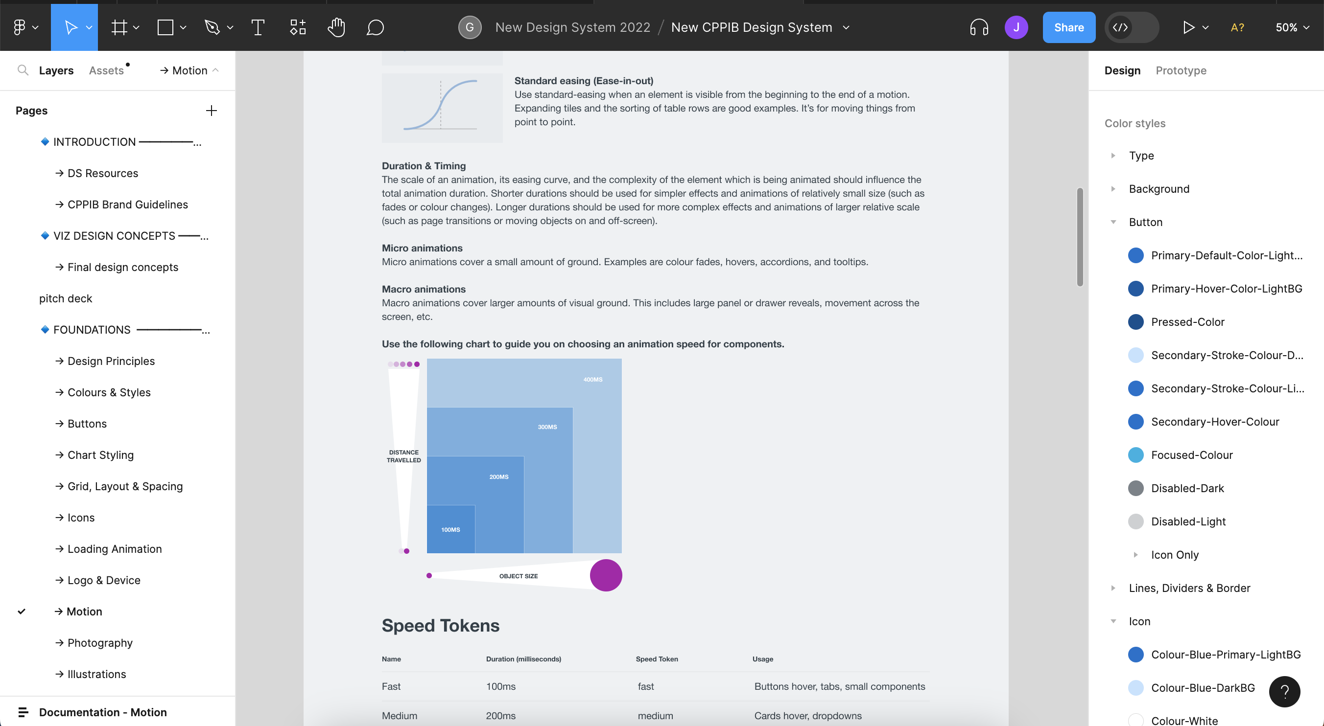
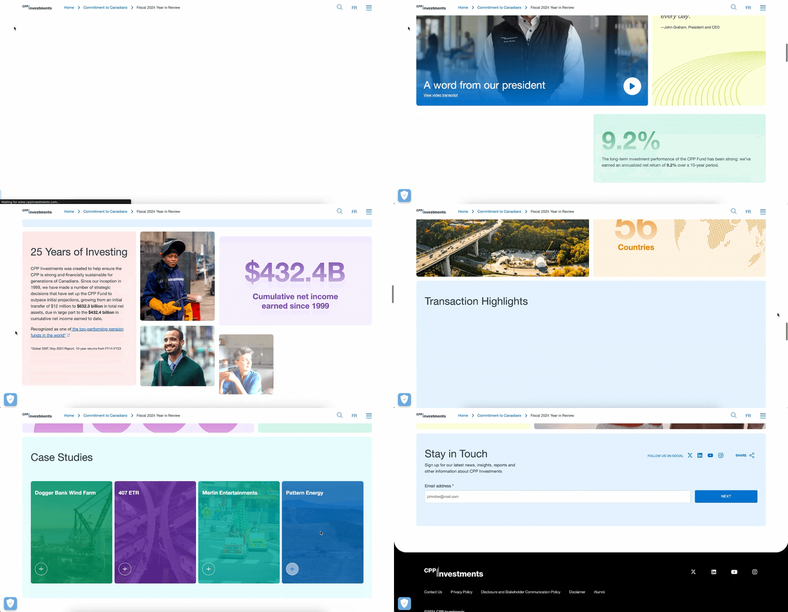
Graphs and critical results were given emphasis, with movement and animation.


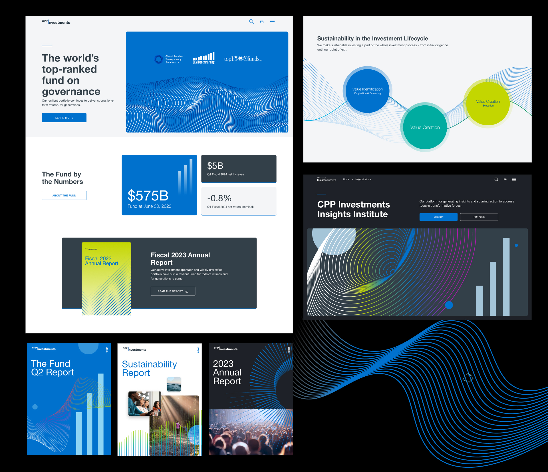
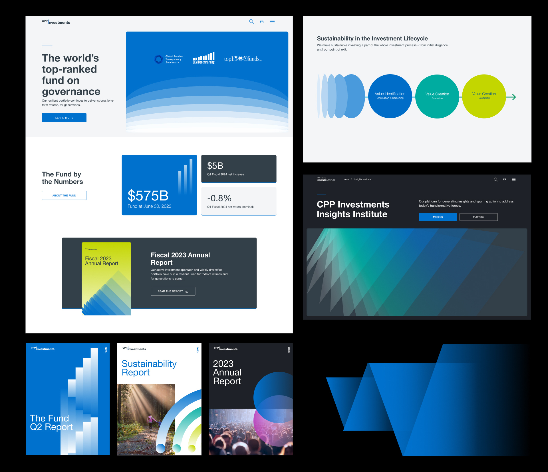
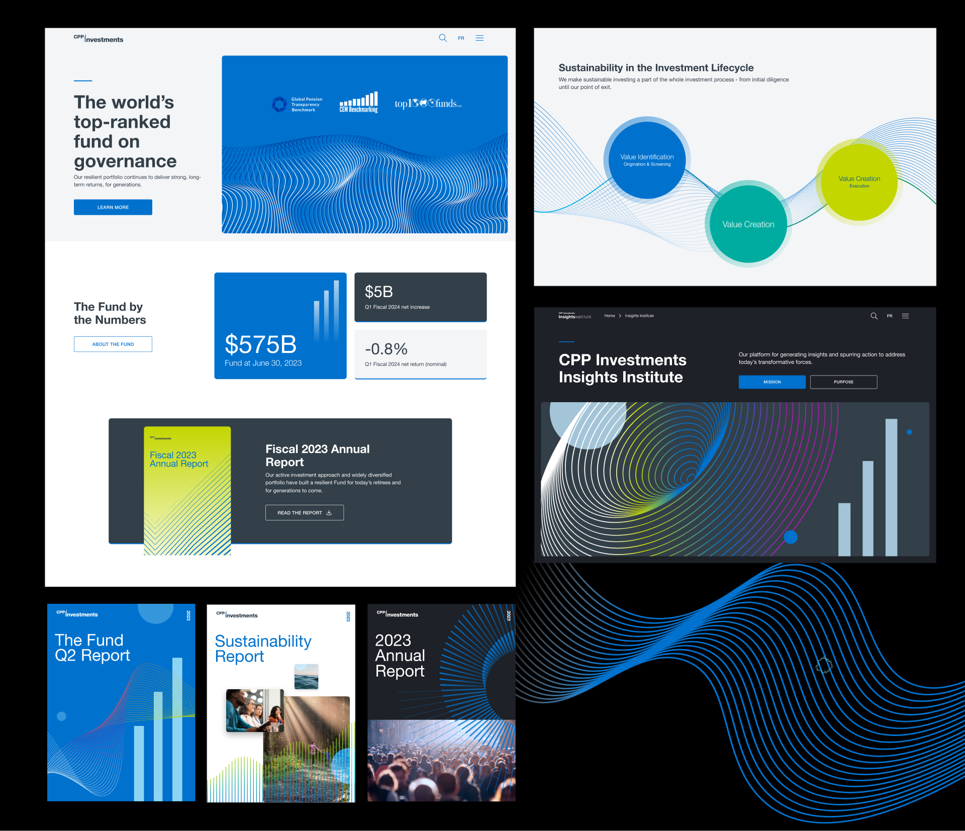
An Evolving Brand Identity
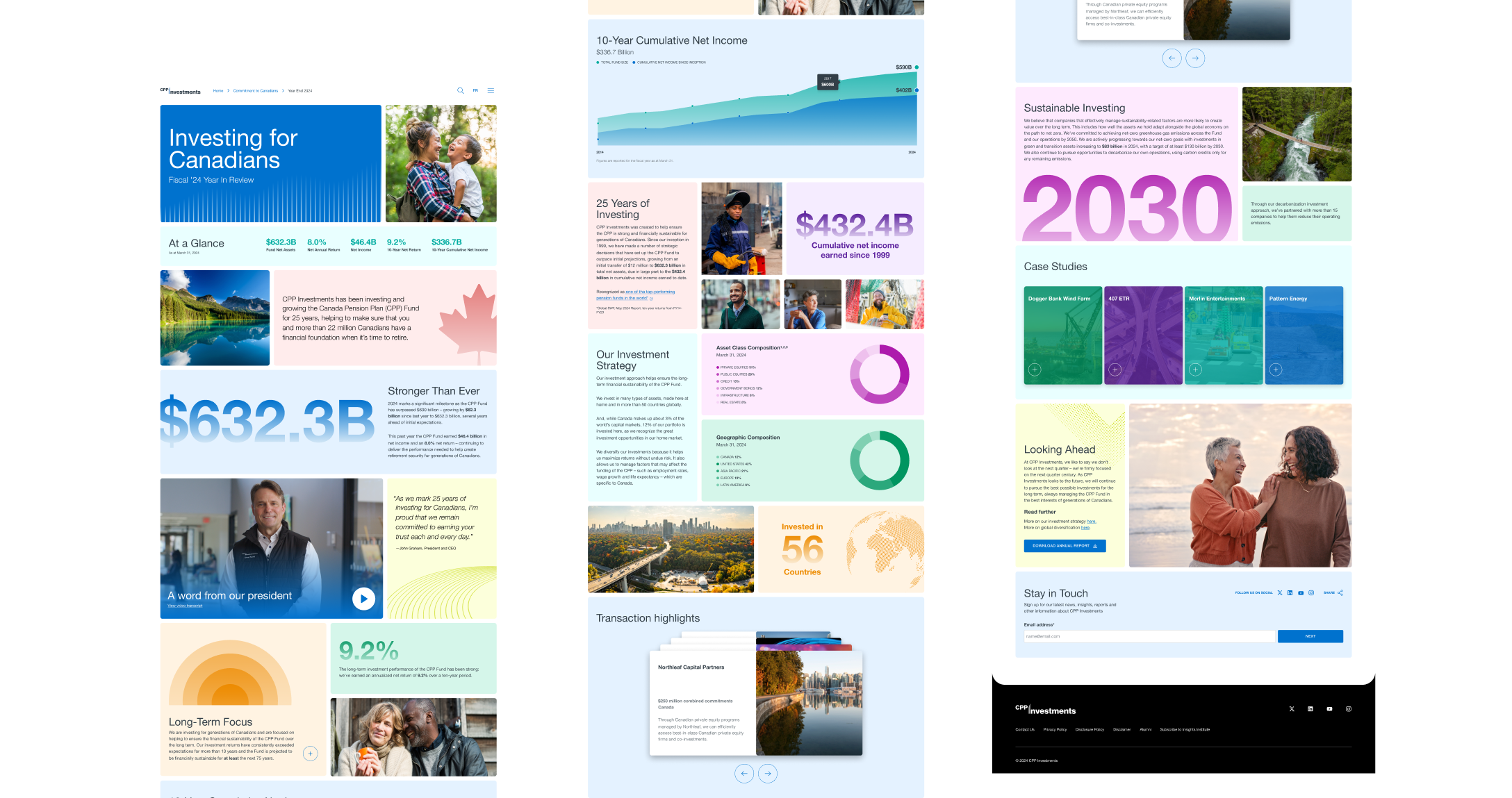
As the site continues to be redesigned page by page, we worked with CPPIB to show them how their brand can evolve over time and explored various graphic devices and styles to be used across their digital channels. Here are two moodboards for two different directions.