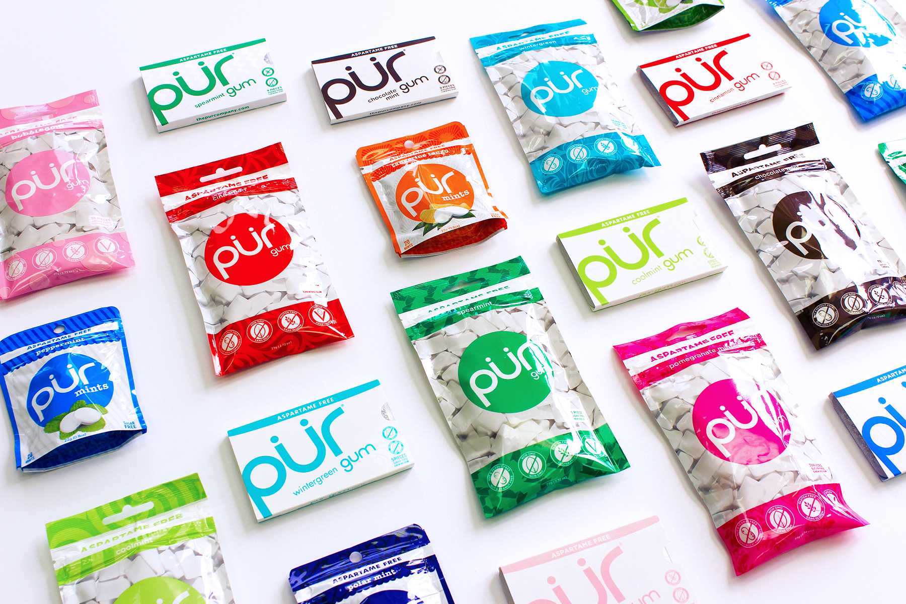
The PUR Company
Positioning PUR as a leading health brand focused on helping people make simple, everyday swaps that lead to a better life.
Challenge
PUR needed a cohesive, strategically defined brand identity that could scale across a growing product line and expanding touchpoints—from packaging to digital to retail. As the company entered new categories, including its first move into snacking with PUR Popcorn, there was a need to align product innovation, consumer insights, and brand expression while clearly communicating the value of design to internal stakeholders.
Solution
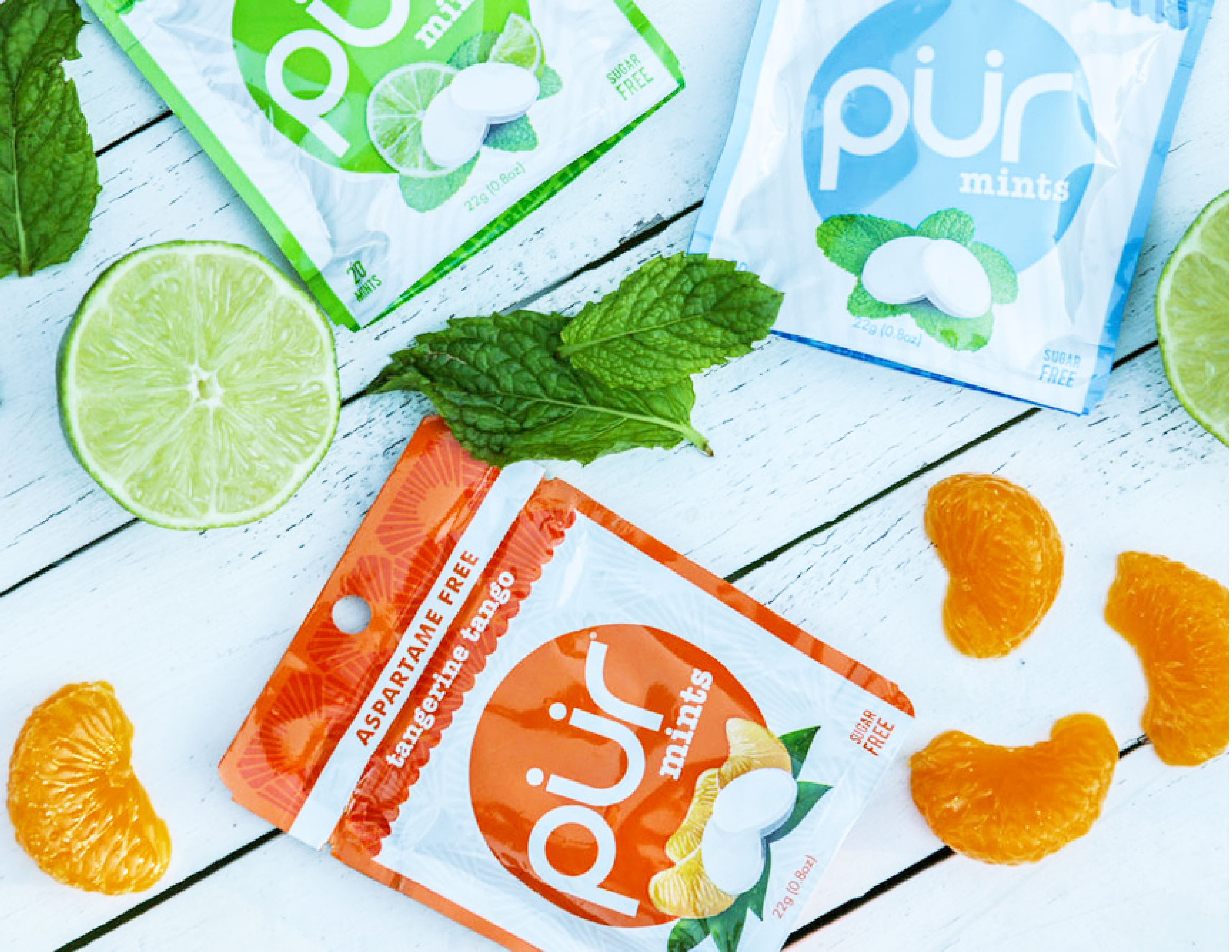
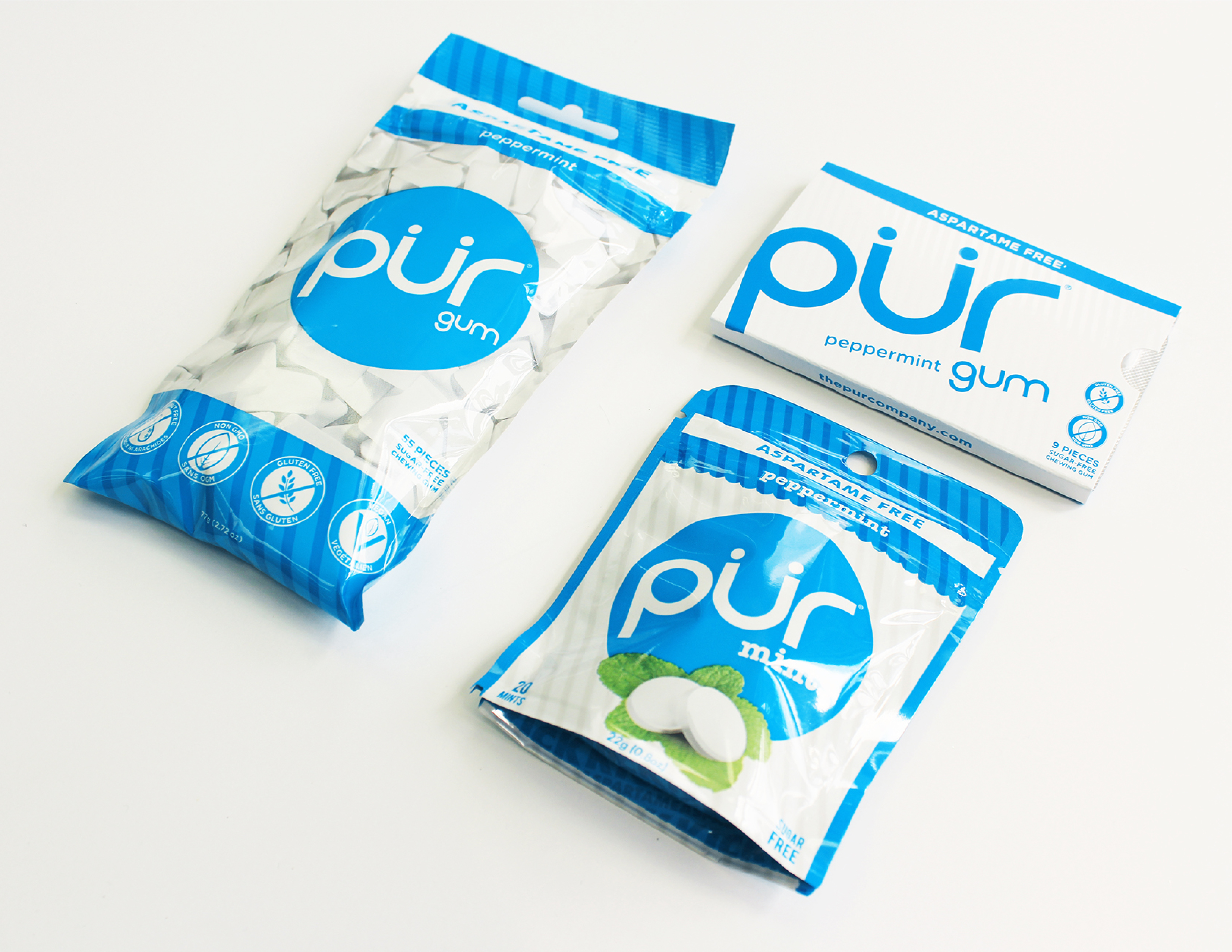
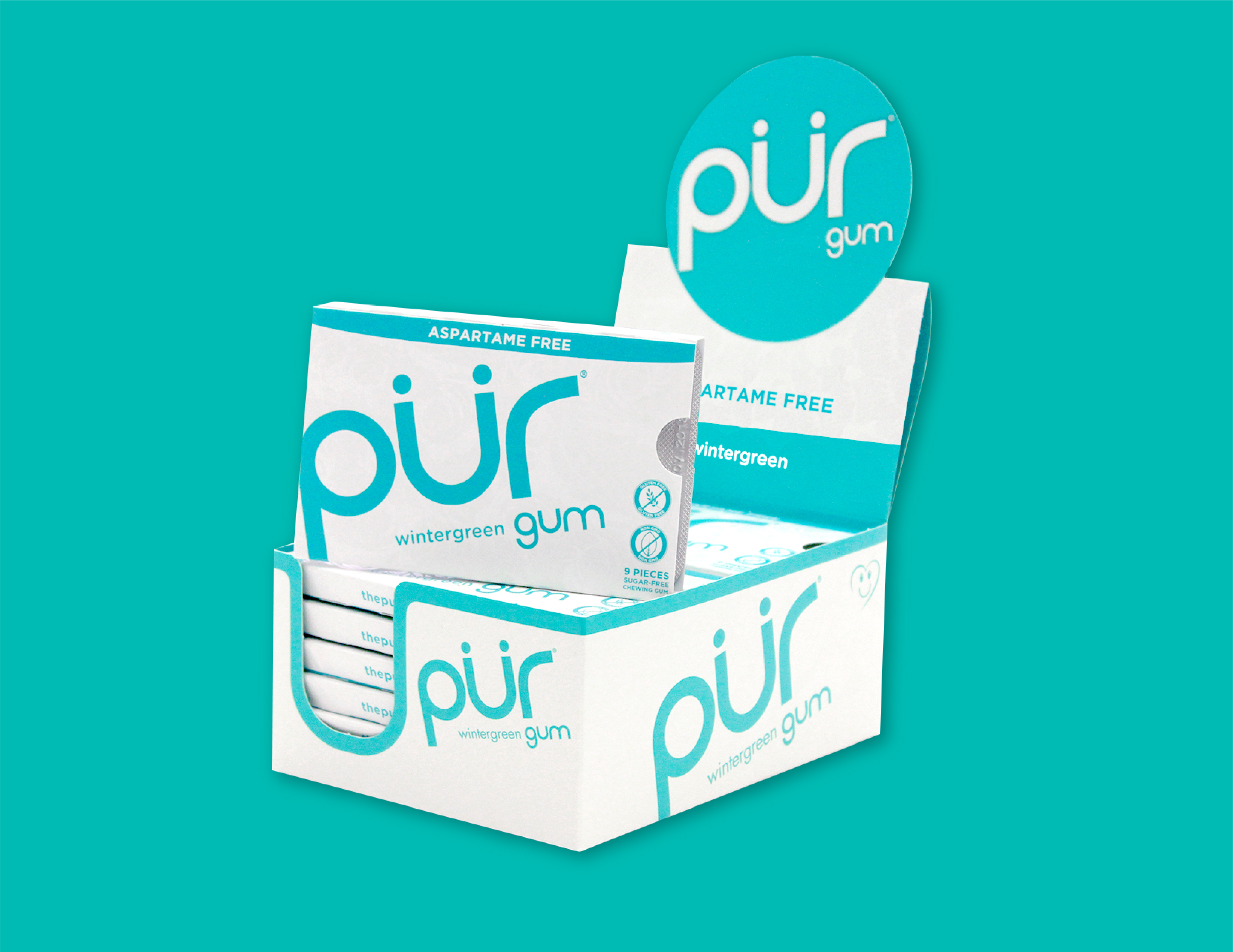
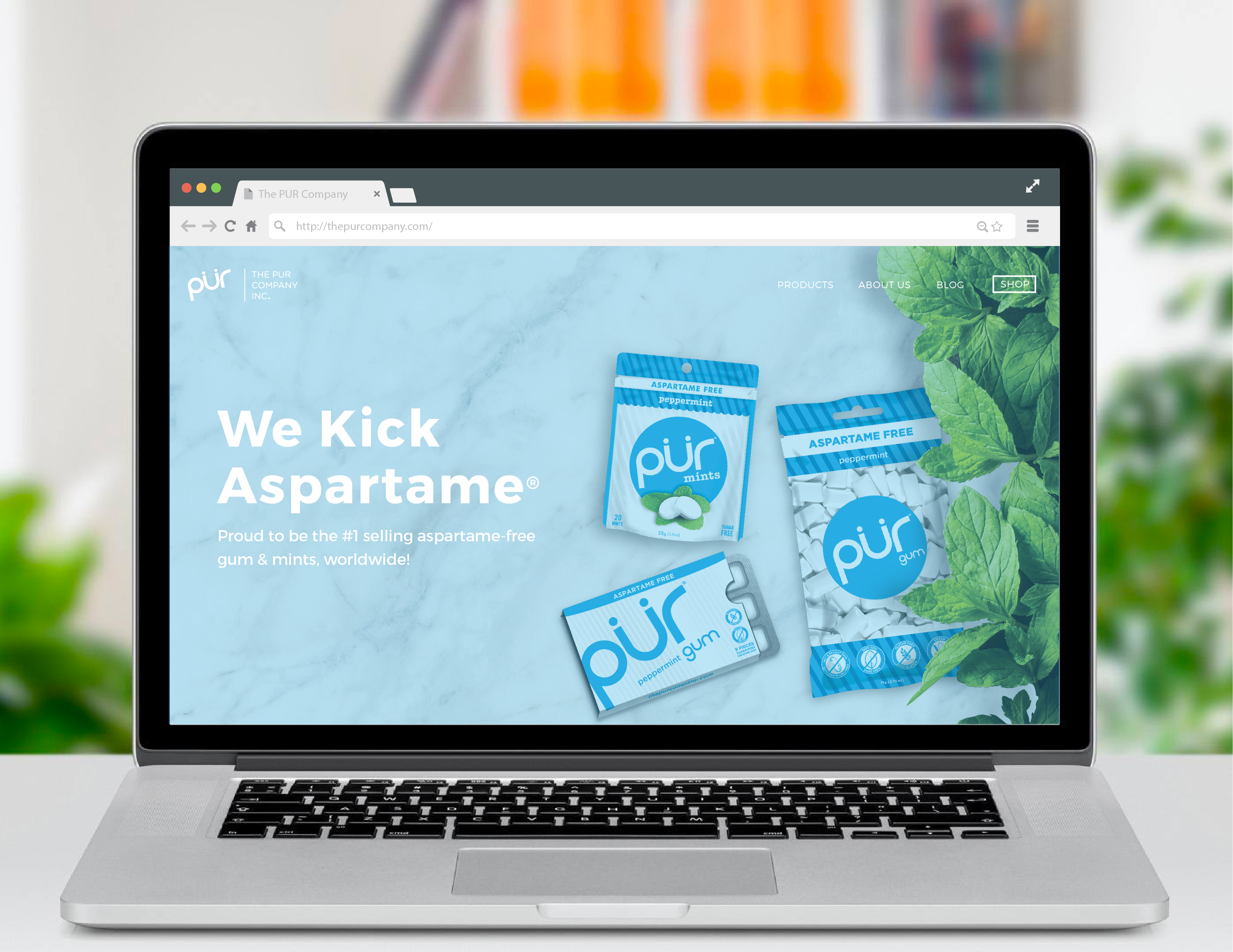
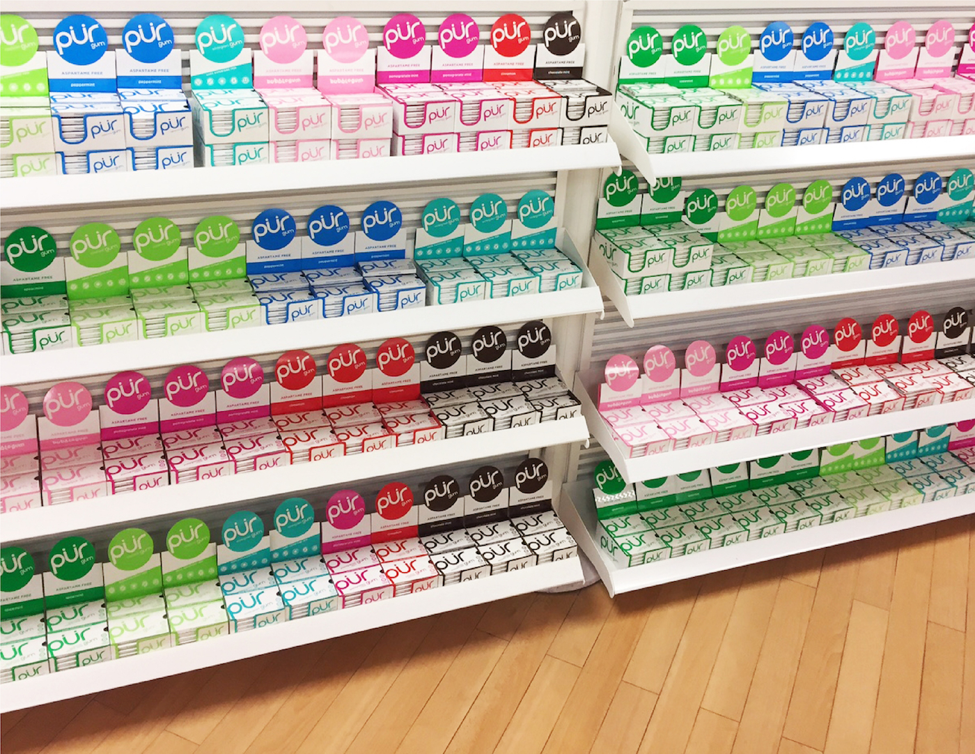
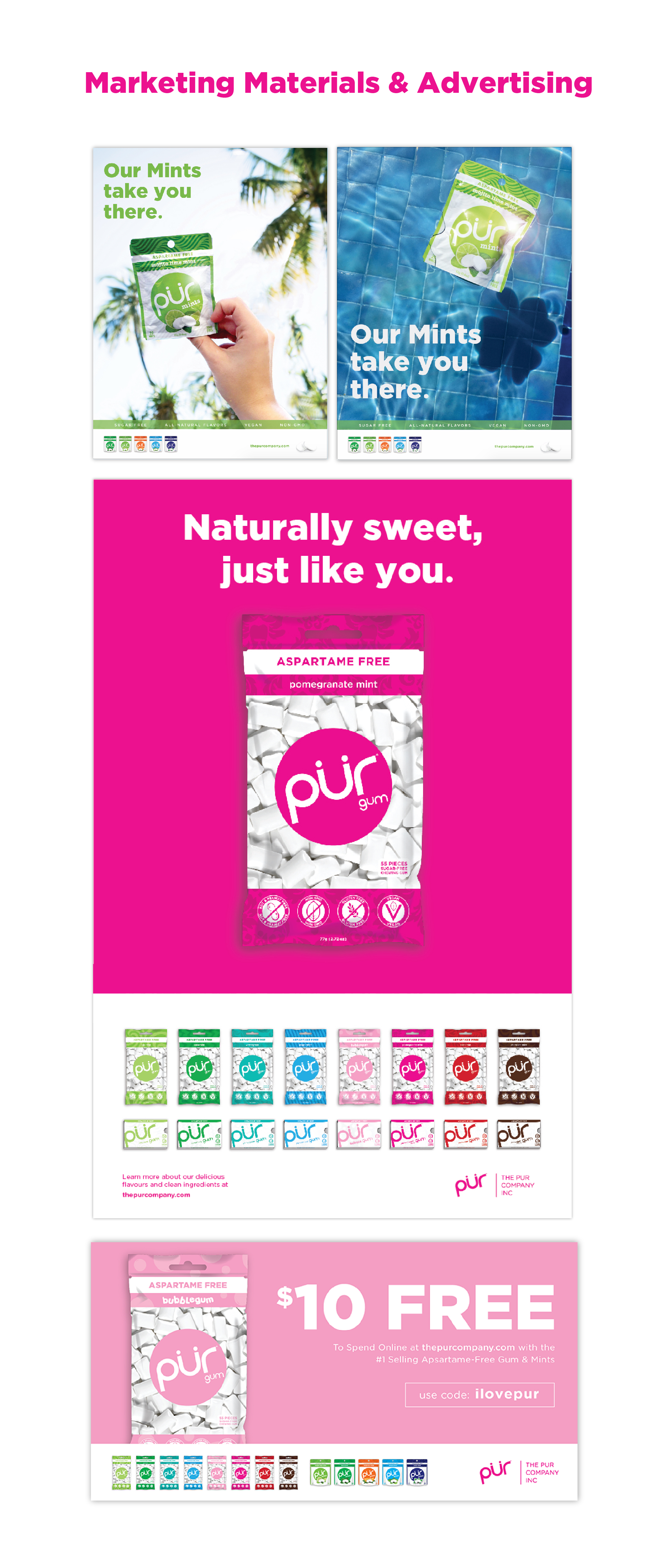
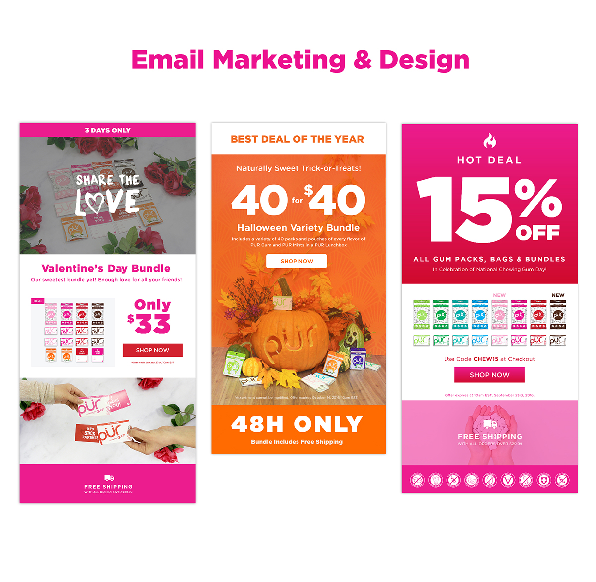
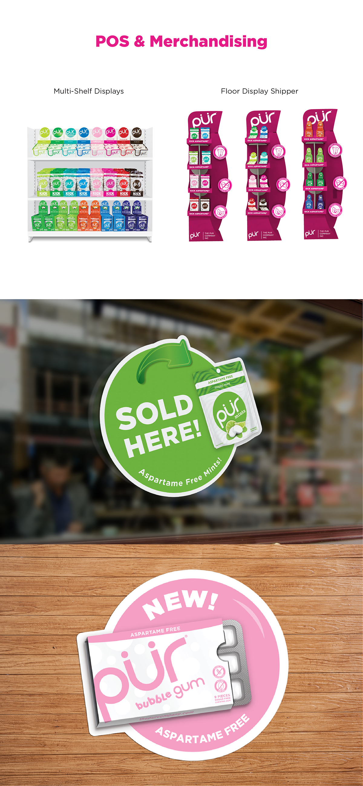
As the primary in-house designer, I collaborated with the creative manager to establish and evolve a unified brand system across all touchpoints, including corporate identity, packaging, digital and e-commerce UX/UI, marketing, trade environments, and social content. I partnered closely with sales and marketing teams, contributing to R&D through consumer research, competitive analysis, and rapid prototyping to bring new products to market. In parallel, I supported and mentored junior designers while advocating for design as a strategic driver of business value, helping elevate both brand perception and product impact.
PROJECT
Visual design for marketing, CRM, social, packaging, and general sales and brand materials, web design, experiential (tradeshows and POS), photography, and product development, and more
ROLE
Designer
COLLABORATION
In-house designer under the creative direction of Dalia Shankman
WEBSITE
thepurcompany.com
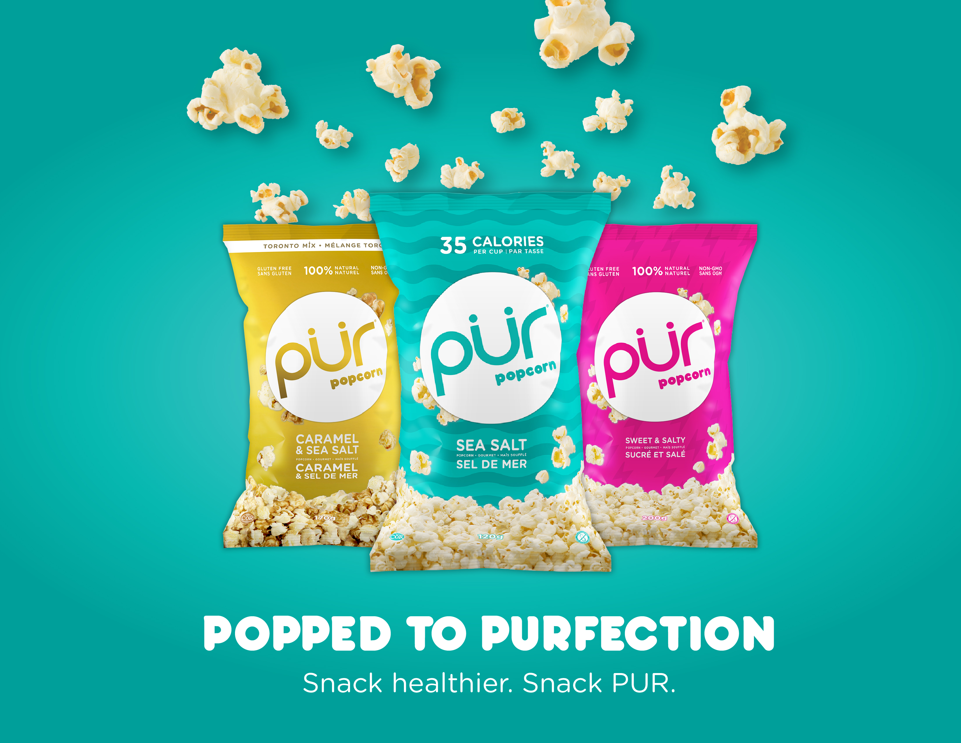
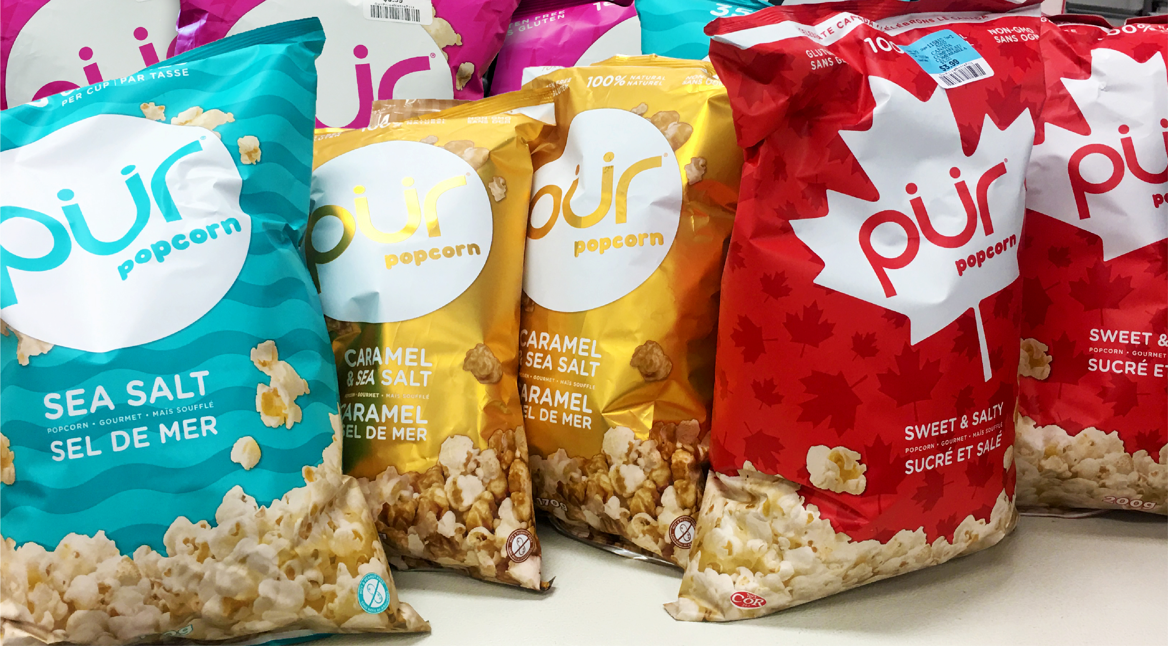
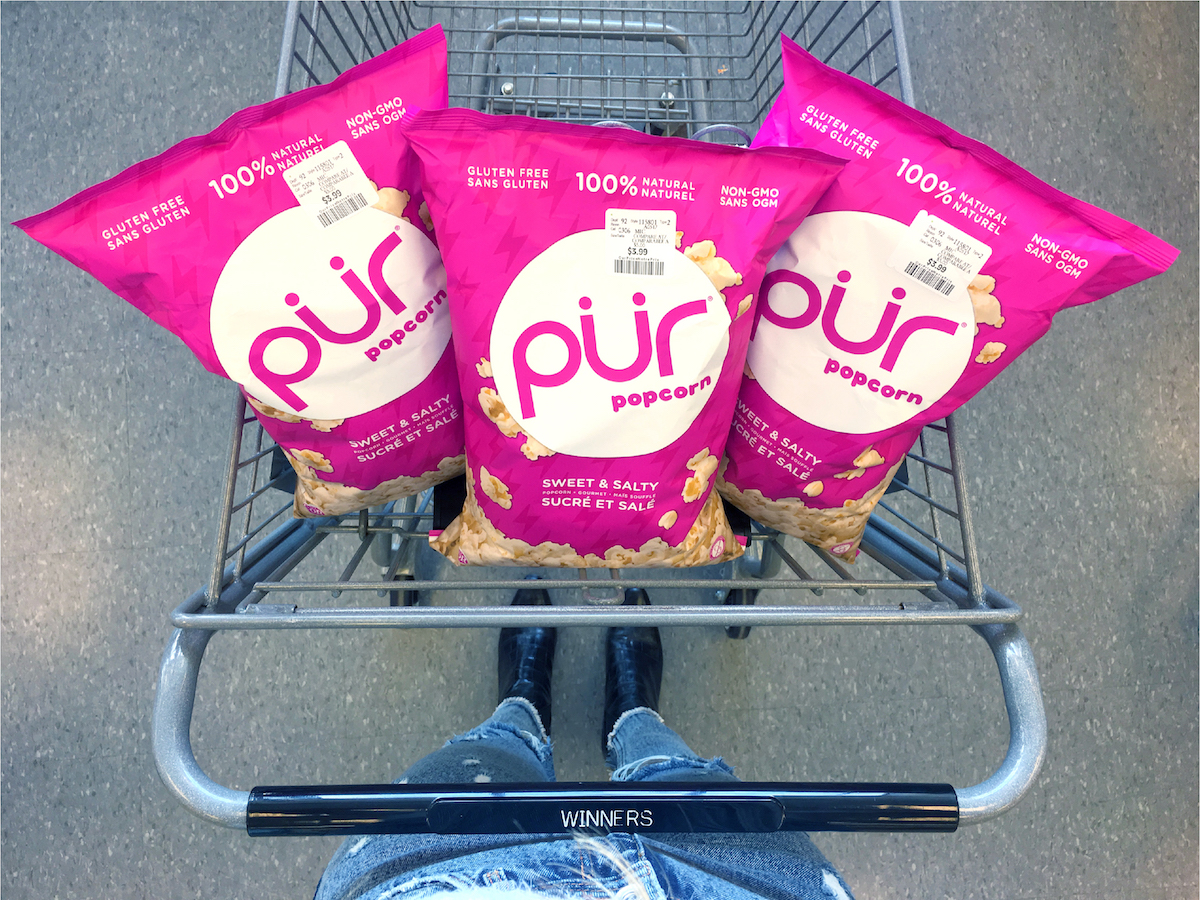
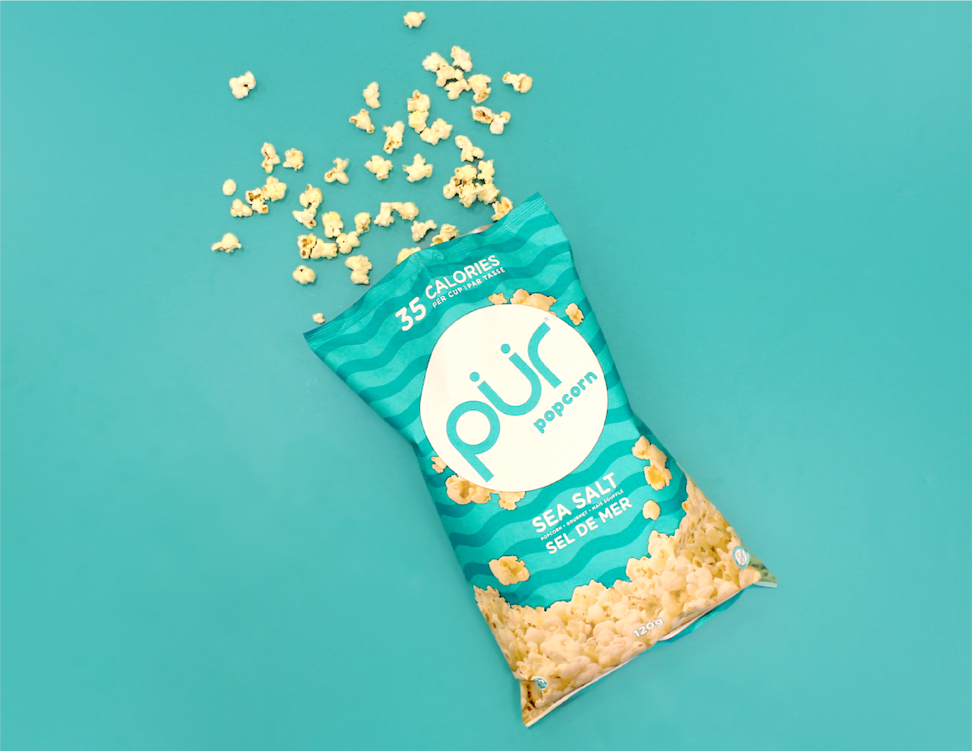
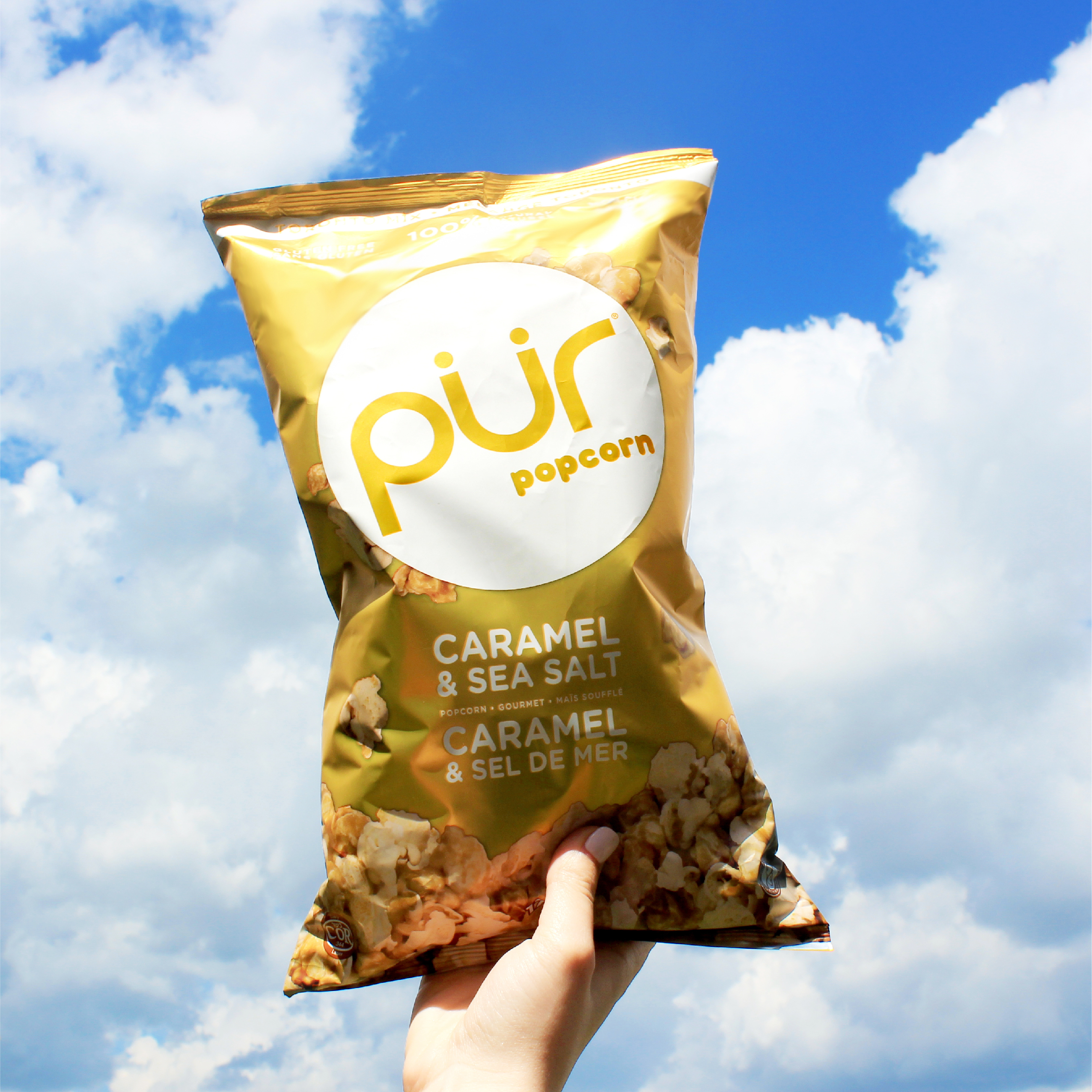
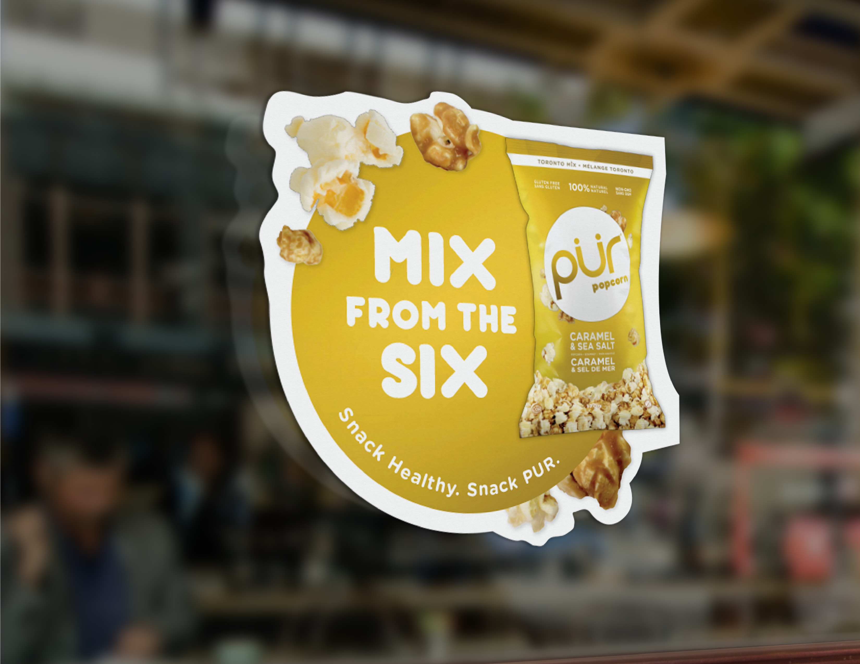
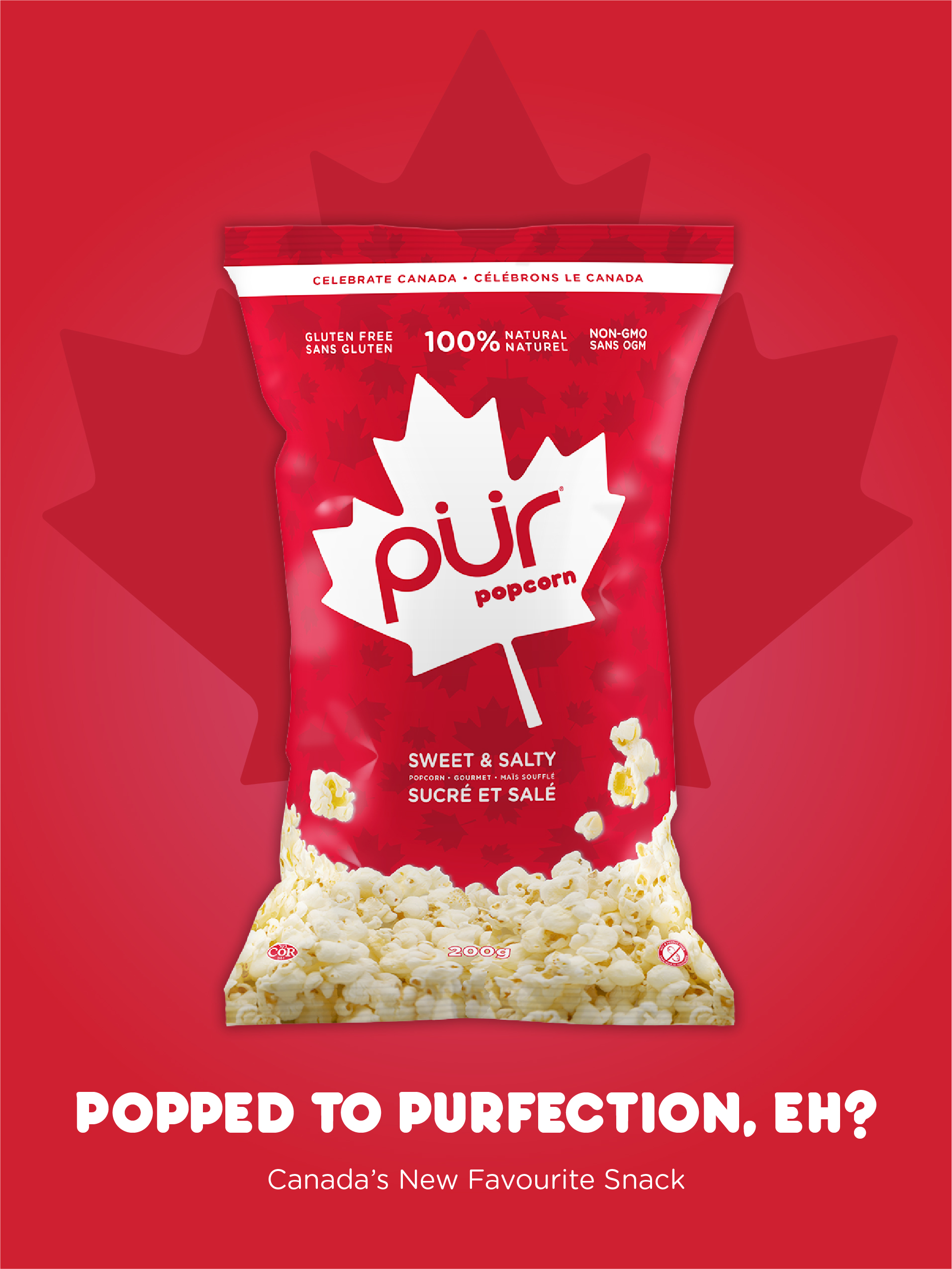
PUR Popcorn Product Launch
PUR Popcorn Product Launch: The first foray into the wider snacking category.
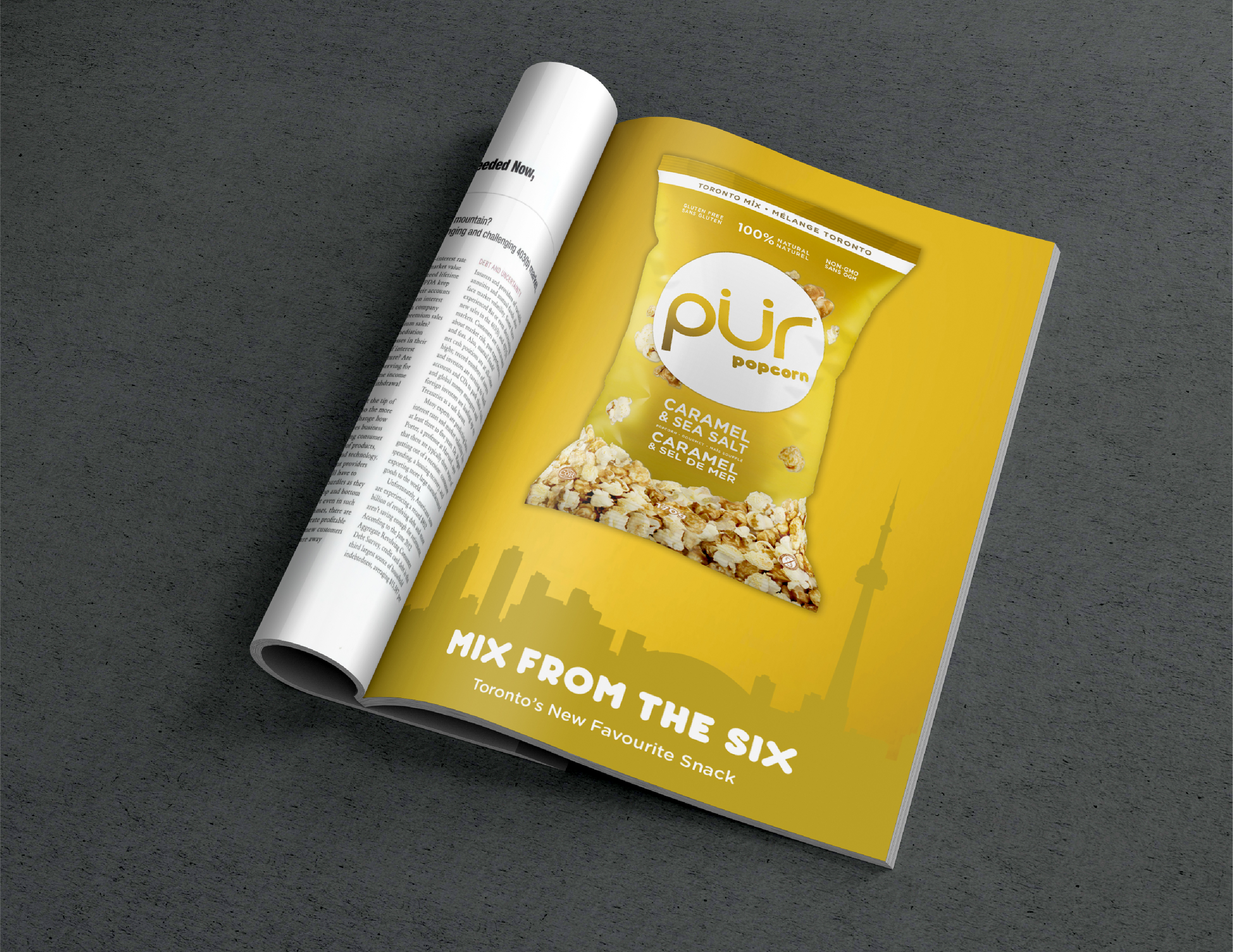
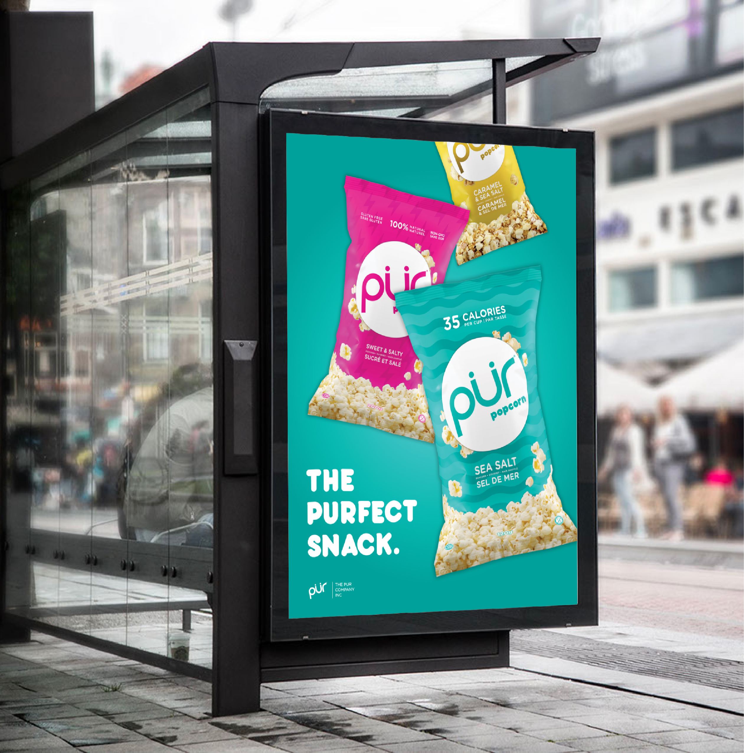
PUR Popcorn’s packaging was designed to make a bold impact while seamlessly extending the existing brand. Bright, pop-art inspired colors, a punchy white logo, and clean, approachable layouts helped the product stand out on shelf while staying true to PUR’s aesthetic of delightful simplicity. Each flavor was differentiated through finish and tone—most notably a metallic gold for Caramel & Sea Salt (“Toronto Mix”), a nod to the brand’s hometown and the flavor’s more indulgent feel—while maintaining a cohesive system across the line.
Delivered within a tight four-month timeline spanning R&D, design, production, and marketing (including a responsive microsite), the launch disrupted the category’s typically muted visual landscape. The result was strong brand recognition and immediate demand, with all three flavors selling out within weeks and marking a successful expansion into the snacking category.
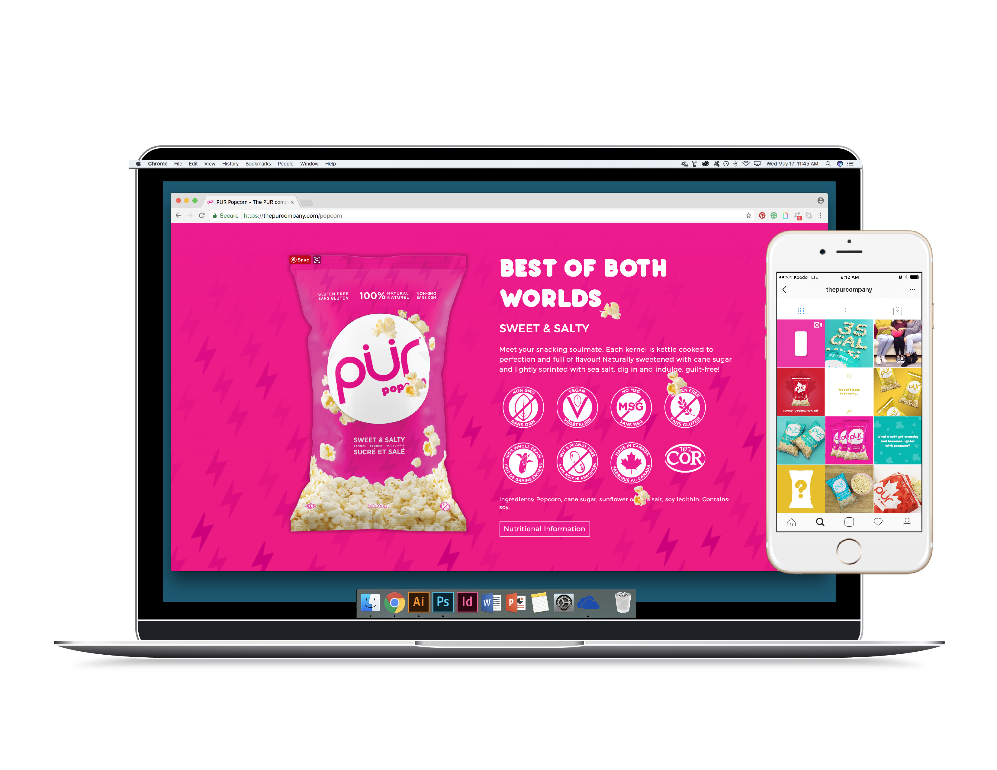
MICROSITE: thepurcompany.com/popcorn
SERVICES: Package Design, Microsite Design, Marketing